Blush Pink and Blue (Rose Quartz and Serenity): Can They Be Married at Your Wedding?
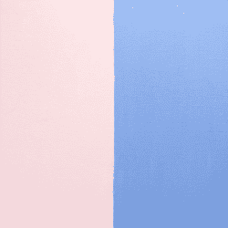
Rose Quartz and Serenity, 2016 Pantone Colors of The Year
Pantone has been choosing a color of the year since 1999. The color of the year is typically a big influencer in the world of fashion and home décor and is chosen because it reflects the global moods within our culture. If you follow the “color of the year” you may recall that the select color for 2015 was Marsala. It’s a warm and sophisticated color that pairs well with brighter colors, or whites and ivories.
Marsala, 2015 Color Of The Year, continues to be popular with our brides.
This year, for the first time ever, Pantone has chosen two colors that floral designers should, in theory, really be able to wrap their clippers around – rose quartz and serenity. These lighter pink and blue colors are found naturally in florals. We have been using pale pinks and blush with ivories and whites for the last year to great effect. Rose quartz can be revealed with roses variations like Sweet Eskimo and Pink Majolika. Serenity is found in Guardian Blue Delphinium, Hydrangea and Tweedia. All of these are perfect blooms for bouquets and arrangements.
data-animation-override>
““Joined together, Rose Quartz and Serenity demonstrate an inherent balance between a warmer embracing rose tone and the cooler tranquil blue, reflecting connection and wellness as well as a soothing
sense of order and peace.”
”
So the big question for me as a designer has been and continues to be – can these two lovely colors work together in the overall design for a wedding?
The first time I saw the color duo was this spring at the Atlanta Gift Show. The display included home décor elements, linens and table settings. I wasn’t sure how I felt about it. As a designer, I had always been leery of the combination of pink and blue for weddings, thinking that the two colors were linked too closely to nurseries and baby showers. In years past, a handful of brides have asked me about using similar pinks and blues together and I lured them away from the pairing for fear they would be disappointed with the result.
I may be, albeit slowly, experiencing a change of heart. We have been working with a lot of pale pink. Now, soft bits of blue are showing up in places I would never have imagined but am really excited about.
Are they really meant to be together as equals?
The bride and groom – definitely. Pink and Blue, still not so sure. My sister Heather challenged me this past weekend. “Jenn” she says, “a lovely bride comes in with her color palette of blue and pink and asks you to help her create the wedding she has always dreamed of. How are you going to pull it off?”
I wasn’t getting my second cup of tea until I answered. As we chatted, I was delighted to finding myself falling in love with some ideas that would work beautifully at venues here in Northern Virginia and elsewhere.
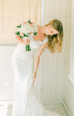
Friend, and former Colgate University soccer player, Madeline Bosco carried a color close to Rose Quartz in summer ’16 . (photo: Loveandlightphotographs)
Soften the contrasts:
With this style, we could avoid putting both colors together. Instead, we create a design that uses common elements like white or ivory flowers and lush greenery in each bouquet and arrangement. These common elements will unite both colors. The bride could carry a beautiful white bouquet with a subtle pink bloom under the white flowers or off to one side. I might even add a sprig or two of blue. The bridesmaids could then wear pink or shades of pink and carry the neutral white with green foliage and a bit more of the subtle blue. This color combo could easily be reversed with blue dresses and subtle shades of pink flowers.
For this design, I would avoid using the two colors in the same vase or arrangement. Instead, I would place them on different tables throughout the ceremony, using the same common elements to tie all of the flowers together.
Alternate from one color to the other (color block):
With this design, I would use pops of color to create a luxury feel. Imagine an arrangement for a longer table that has concentrations of each color, in this case, blue, white, then pink. Luxury designs often use a lot of one element like a large grouping of orchids. I like this simple but abundant feel. Another way to make this table arrangement work is to group bigger blooms in these colors.
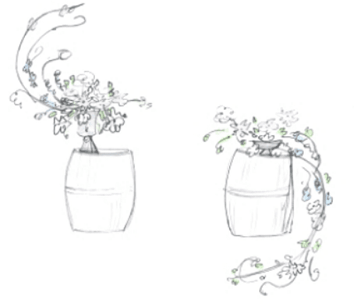
A quick drawing to show graduating from the Pantone Colors of the Year.
The simple sketch shown here (left) is ceremony design. Wine barrels are such a lovely shade of warm brown and we have easy to access to them in this part of Virginia wine country. I really like the color with the Rose Quartz and Serenity. The taller arrangement in the design features reaching blooms of blue that flow into the white flowers in the middle, completing the elegant “S” shape with airy pink blossoms. The second arrangement picks up the pink blossoms, graduating again into the white flowers, finally cascading delicately with more of the original blue blooms.

This color palette of gray, Serenity, warmer pink, Rose Quartz and ivory is perfect example of expanding the palette to create deeper look.
Get colorful:
A palette shouldn’t be three separate colors anyway. Instead of using a single pink or blue, I would incorporate shades of those colors that blend. An expanded palette really helps to achieve depth. As we look at a painting, our eye sees the lighter shades first and then finds the darker elements. We could use shades of pink and blue to bring out the highs and lows in this palette.
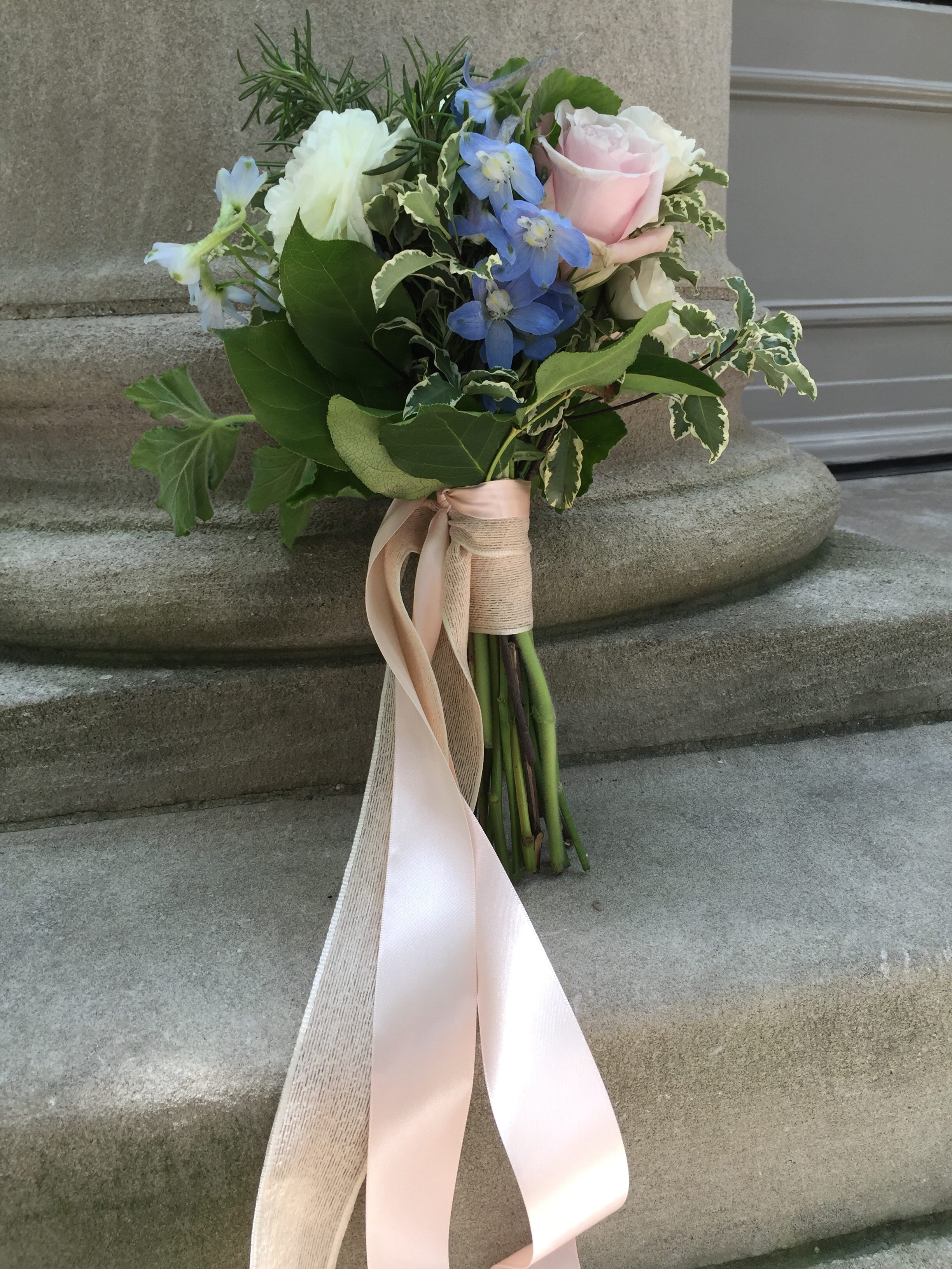
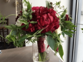
I arranged this bouquet before delivering a wedding to the Meridian International Center in Washington, DC.
Go for it anyway:
At the end of our Saturday morning tea we decided to head to the studio a little early so that we could put these Pantone colors to the test. I went through the cooler and chose a few stems that were nearly exact matches and created a very simple hand-tied bouquet. We took the bouquet with us while we delivered a gorgeous Marsala-inspired wedding to the Meridian International Center in Washington, DC and snapped a few photos.
I really liked the result and I think I have more than a few ideas ready for you if this is the direction you would like to take. It could be very simple and very, very pretty.
More information about the Pantone Color of the Year 2016 can be found at: http://www.pantone.com/color-of-the-year-2016?from=topNav

Leave a Comment