Color of the Year: Living Coral (and Flowers)
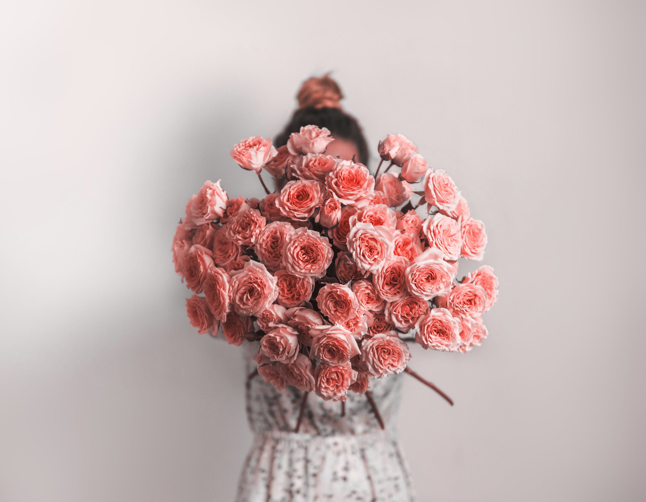
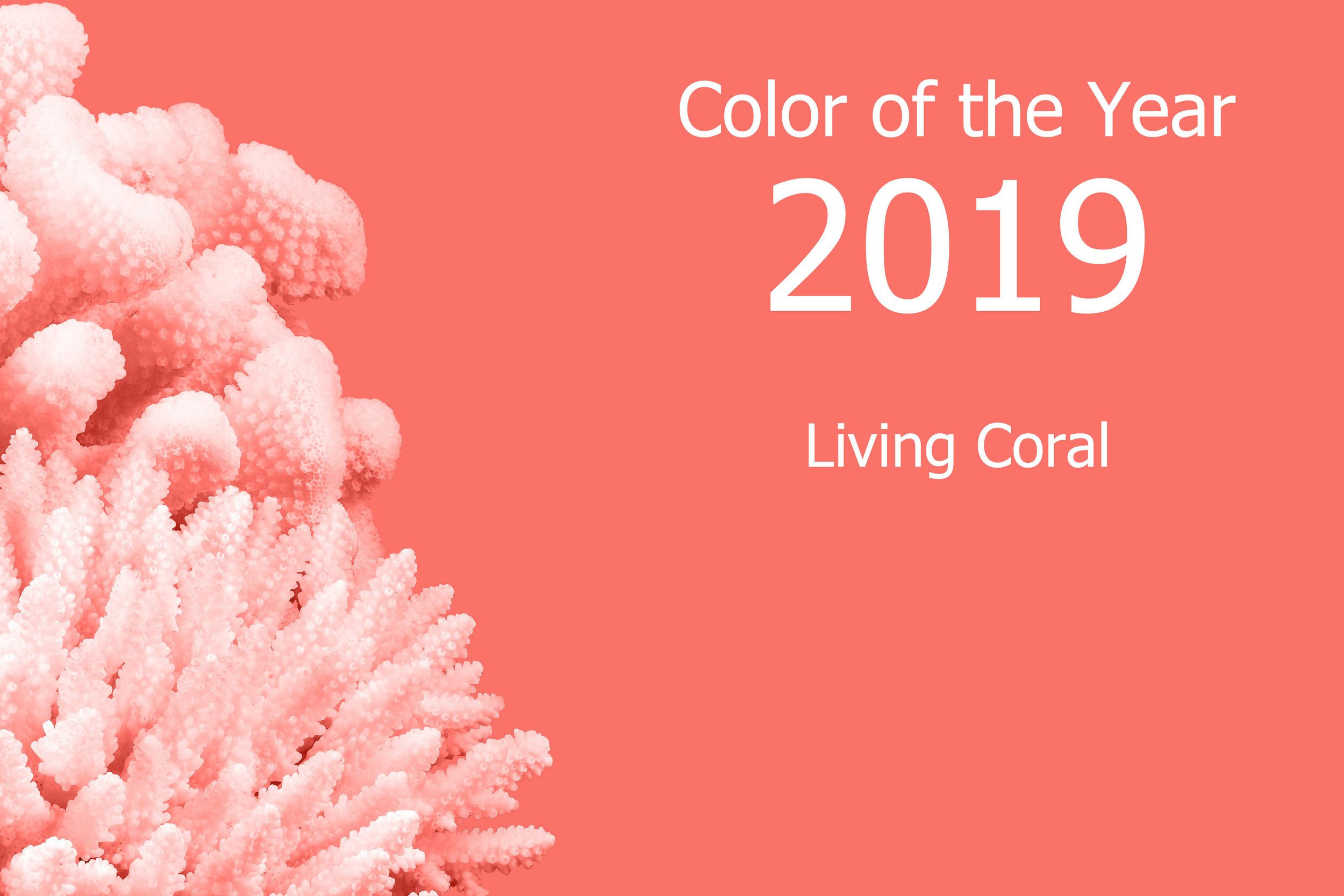
Each year, the Pantone Institute chooses a color that is influencing trends and cultural concepts like fashion, the natural world (including undersea), and in the case of this year’s selection, social media. Each year, we await the announcement with the hope that, as floral designers, we can enjoy this trend color through the artistry of flowers. The 2019 selection of “Living Coral” is a color that takes so many natural forms in the world of flowers. It’s a warm and sunny color, and whether you call it coral, orange or peach, it’s a color that has been growing in popularity for both weddings and every day floral design.
If you are planning a wedding, a color like Living Coral can be included in many palettes and provide whimsy, warmth and delight in your designs. In fact, the description provided on the Pantone web-site expresses exactly the kind of mood and emotion that many wedding couples are looking for in 2019. Living Coral “welcomes and encourages lighthearted activity. Symbolizing our innate need for optimism and joyful pursuits, Pantone 16-1546 Living Coral embodies our desire for playful expression.” Sounds like a wedding to me. Now the question is what flowers can you use to achieve this hue or a more expansive range of color inspired by Living Coral.
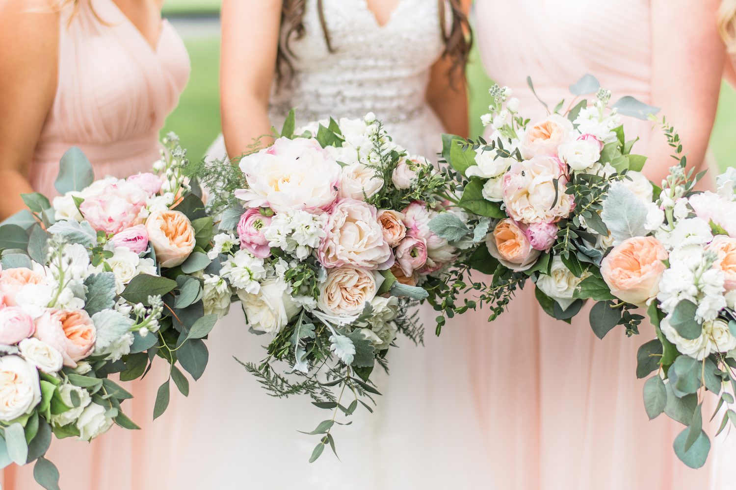
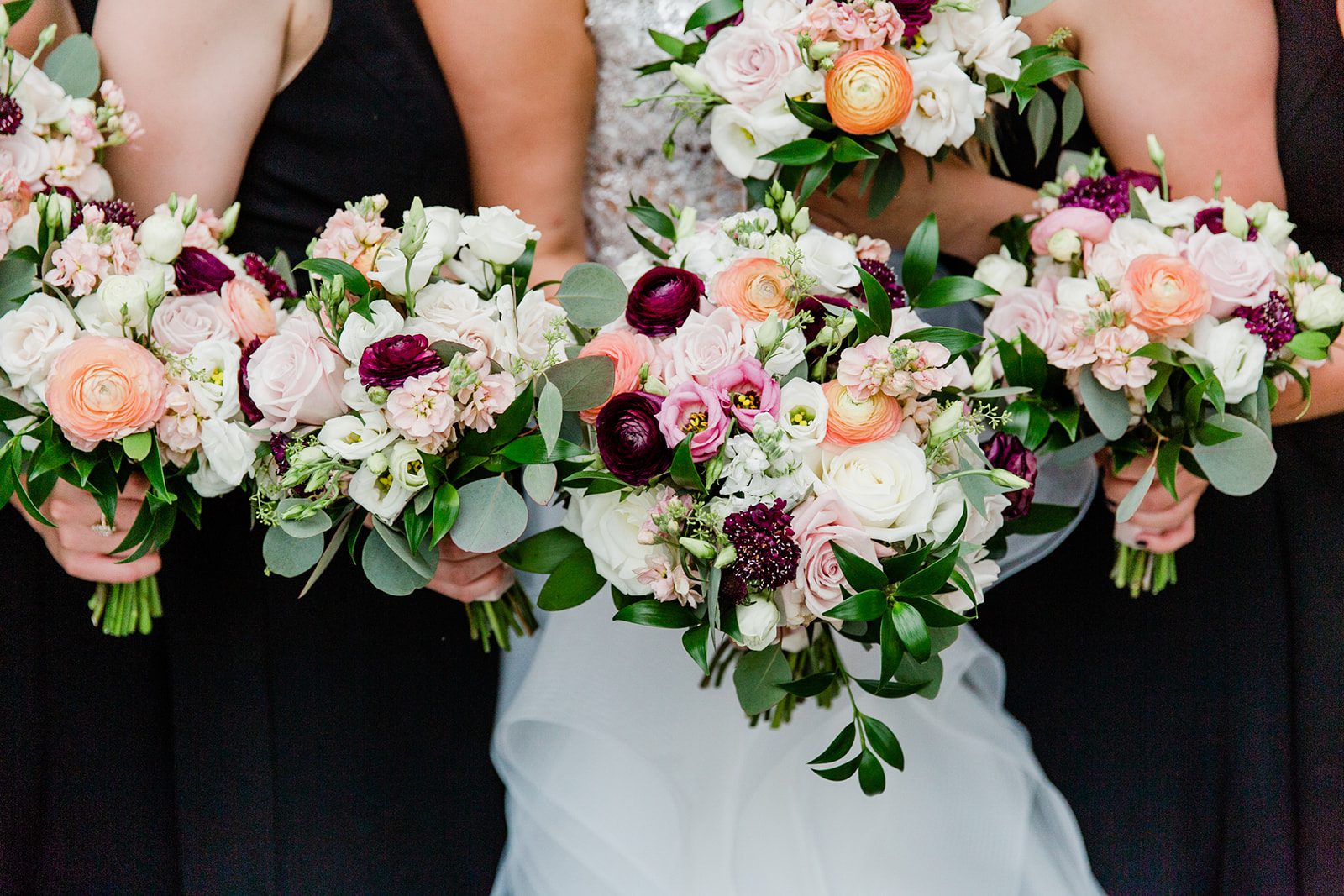
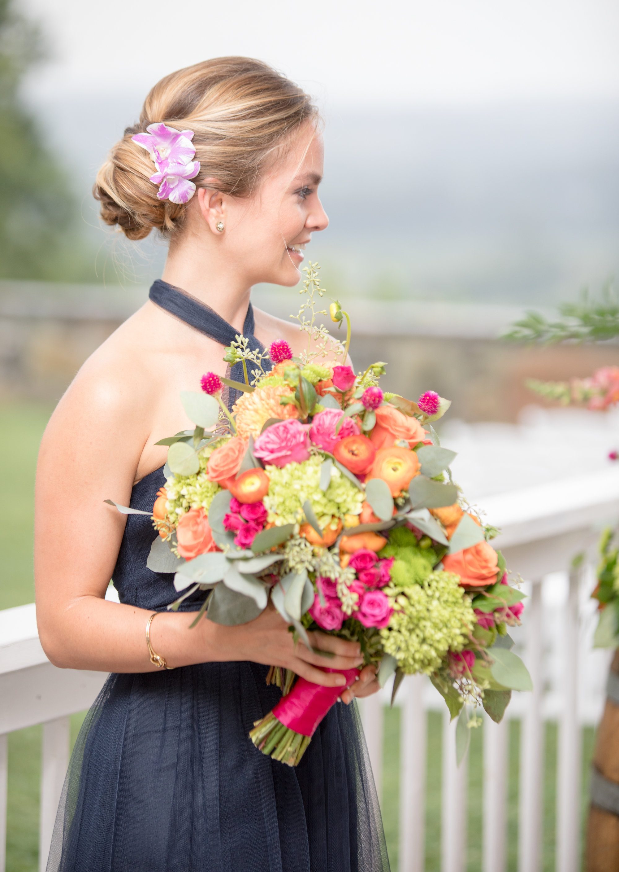
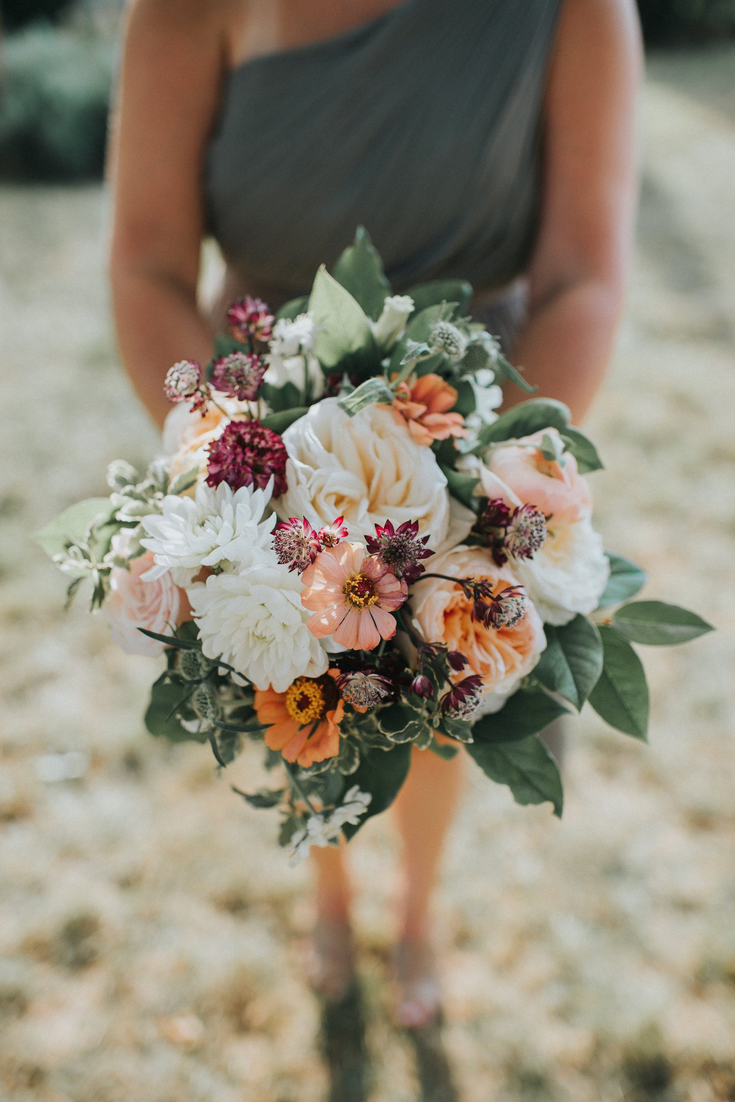
Here are a few recent weddings that incorporated the warmth of this fantastic orange/coral/peach tone. We’ve named the flowers in the color family, but I am especially excited about the total palette selected by each couple. The softer Spring wedding shown above on the left is a combination of pale pink, blush, white and sage-green. The Fall wedding (right) includes dramatic pops of “Marsala” (Pantone’s Color of the Year in 2015), perhaps more commonly known as burgundy. We limited the use of the darker tones in this particular design so as not to overwhelm the neutral tones. You can also use “Living Coral” as the softest color in a palette with even more vibrant colors.
The Summer wedding below on the left included the vibrant Mini-green Hydrangea, or Viburnum, with Raspberry Spray Rose and Gomphrena. The Fall wedding on the right is a much softer palette that includes a lot of color anchored by the peach Zinnia and even subtler, Cafe Au Lait Dahlia.
Flowers in “Living Coral” aren’t limited to weddings
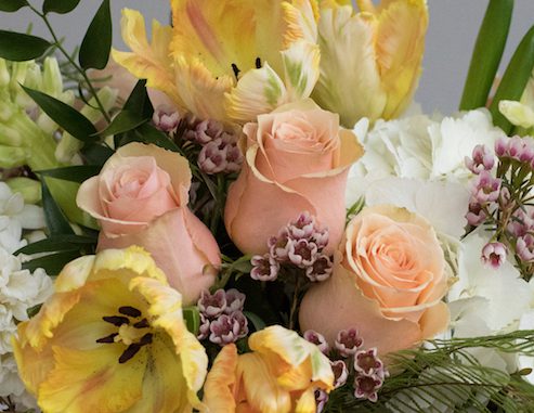
Roses and Parrot Tulips hint at “Living Coral” in this J. Morris Flowers every day floral design for Spring.
You can get a close match to Living Coral with quite a few other flowers. Roses, Spray Roses, Dahlias, Carnations, Tulips and Calla Lilly all come in varieties similar in tone to the Pantone Selection. There are a host of Tropicals in even more vibrant hues like Birds of Paradise and Crocosmia.
Flowers allow you to enjoy a popular trend color in your home without overcommitting to the look. Use trendy flowers in cool vases instead of purchasing pillows and throws. If you’re like me, you like seasonal elements in home decor and Living Color will look pretty with Spring pastels, as well as the colors of Summer and Fall. Designing for your own party or event? Use Living Color to warm up the atmosphere and delight your guests.
Want help designing flowers for your wedding or party? We’re happy to help. Contact us for more information or call to speak to one of our designers at 703-779-3530.
Thanks to the following photographers for the amazing images that captured these colors (in order that they appear): Spring Wedding, Stephanie Messick; Fall wedding, Susie and Becky Photography; Vibrant wedding, Leslie Maron Photography: Muted Fall wedding, Purple Fern Photography.

Leave a Comment